When creating a personal logo, it is important to be intentional with the design so that it effectively expresses your unique value and personality. It took me a while to decide on a logo for myself, and today I finally submitted my finalized logo to my instructor.


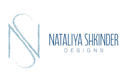
I decided on blue for my color, which was a very difficult choice because I love so many colors, and I wanted it to accurately represent me. I also have a black and white version, which I think looks very clean. I used a textured stroke for my mark so that it has some personality and adds dimension. I was satisfied with the font that I found, and I kept everything in all caps because I feel like it creates a good base at the bottom of the logo, with the tops of each letter aligning nicely.

Here is a screenshot of my workspace in Illustrator, where you can see my thought process and all of the different versions I created before I finalized my logo. I also have a lot of versions that I sketched before I went into Illustrator. It was difficult to create a mark with my initials because they didn’t combine very well, so it was a light bulb moment for me once I discovered the mark that I have that includes both of my initials smoothly.